Tuesday, September 18, 2012

My Solo Gallery Show and The Umbrella III

Friends -

I join you tonight with two bits of wonderful news! One being the official completion a new piece the other being the announcement of my own solo Gallery Show!!

The show is to be held October 6th, 2012 at Tumblety-Howell Art Gallery in beautiful Ocean Grove, New Jersey. I would be honored and ecstatic to see your beautiful faces there. You can e-mail me for information, mheter@gmail.com. There are to be about 45-50 works on display in the media of printmaking, sculptural objects and painting!!

As you can see, I've done it again. This installment is the third in the Umbrella series and continues to bring you the maniacal, busy-color  mash-up of plants, people and animals you've come to expect. This umbrella is a bit different from the first two in the fact that it is on a retro 1960's style clear vinyl umbrella. My collection of paint markers, (possibly my greatest asset,)  was once again employed to create the shimmering rainbow fragment that is the norm in this series. Keep your eyes peeled for those quasi-well-known characters that lie within!


As always, I cannot thank you enough for the wonderful compliments, feedback and support I've had from you over the years. In the culmination of over a decade of work, it would be fantastic to see you at my gallery show. I hope to see you in October!

Peace and Love,

-Mike

Tuesday, January 31, 2012

Retrospective Glances: The Umbrella I & II

Hello netfriends!


To tide the blogosphere over until I can bring you my latest projects, this evening I present a look back at a couple of works I created in 2006 and 2008. They are untitled pieces simply referred to as "The Umbrella."

Each umbrella at a 36" diameter is hand drawn and painted in a colorful, busy mash up of cartoon characters. These pieces are very time-consuming but one day I would like to have a room covered in this "design." Although they seem to have a pattern at first glance, the handmade artwork is truly one-of-a-kind, never-to-be-replicated-twice. Umbrella I is the tear-drop umbrella with the long white handle and Umbrella II is the duck-handle umbrella.

As you gaze into the close up photographs, keep your eyes peeled for such quasi-well-known characters as Red Richard (created by fellow artist James T. Arnold) Master Volume, The Raw Sewage Mafia, Dumpy Dolores, Kryptonite Rita, Debbie and Stacy. These umbrellas were done quite sometime ago, so these characters may look a little different from the way they look presently, which to some may be an interesting visual to see how things have evolved over time.

 If you are interested in perhaps owning a hand-decorated umbrella not unlike these ones one day. Please email me, mheter@gmail.com

As always, many thank-yous for checking out my page.

Wednesday, September 28, 2011

DUMPY DOLORES LIVES! One hundred full color, handmade, glittering Dumpy Dolores stickers!

Dear Readers:
Dumpy Dolores has come back to the sticker scene and is more fabulous than ever! Today’s entry focuses on a brand new, unprecedented run of 100 full color, glittering Dumpy Dolores stickers. 


Dumpy Dolores was created in Spring 2006. Eventually after hanging out with a Philadelphia Graffiti Artist Constituency, Dumpy was branded as a graffiti “tag” that I would put up wherever I went. Graffiti falls mostly into three categories: Paint, wheat paste and stickers. Sometimes the lines are blurred in combining the three, but what we see here are true sticker tags. There is a huge subculture of sticker makers out there in real life and on the internet. It’s fun and addicting, too. Just try going to http://www.flickr.com and search for sticker graffiti.If you'd like to see some old pics of your Dear Aunt Dolores, just search for  her by name!

Dumpy Dolores is a punching bag of jokes of vice, gluttony, laziness and being otherwise unkempt. Dumpy lives in our hearts and minds as a reminder of how things could be worse or how great things that are terrible for us are, such as cigarettes and Spam. Yes, Dumpy is aware that food that tastes good is comprised of salt, fat and sugar, which is pretty much all of the ingredients that make Dumpy so delicious herself… that, and 2 packs of menthols a day.
Making sticker graffiti has truly been one of my favorite things about being an artist. I have met and collaborated with amazing artists from all over the world and my art has traveled to far-off lands I can only hope to visit in person myself one day.

 Alas, in April 2009 I was discovered as the leader of this sticker campaign in my hometown of Montclair, NJ where I placed a superfluous amount of stickers within walking distance of my house (and the police station.) The cop who pulled me over immediately recognized 42 Dumpy Dolores stickers on the front seat of my truck. My little art movement cost me a pretty penny. Since then I have not put a single sticker on public property and boy do I miss it. This new generation of stickers is something I hope that will carry on the tradition of sticker tagging and bestow a new era of Dumpy Deliciousness onto the art scene. 

Dumpy Dolores can be found on Facebook where she makes frequent updates about her triumphs and tribulations of being an old rummy with a chest that just won’t quit. Add her today and enjoy some amusing updates in your newsfeed.

As always, many thank-yous for having a look at my blog!
Yours truly,

-Mike

P.S. 
If you would like information on how to obtain a Dumpy Dolores sticker, please email me. mheter@gmail.com

Sunday, June 26, 2011

35 mm B&W Photography

Welcome to another blog entry about my art!

Tonight I join you with something a little different. Photography! Something I love but don't do nearly enough of...

These photographs were created mostly in Fall 2009.

The photographic process is involved and requires a lot of patience. All these photos were snapped, developed and printed by me in the dark room at Montclair State University. My professor was really great and she helped me understand the process much better than the photo professor I had before.

Personally I love the portrait photography myself, but a lot of these pictures were meant as exercises to show the breadth of ways you can capture motion and light.

I won't get too much into the inner workings of how to use a 35 mm camera or darkroom equipment but I hope you enjoy my pictures.


Many thanks to my friends also for posing for these pics. Aren't they beautiful?

Thanks for looking!

-Mike

Monday, June 6, 2011

Monoprint with Handmade Paper Collage


Hello Blogosphere!

I am writing tonight with an entry about a project I completed last fall. This is an edition of 3 monoprints with hand made paper collage elements!

A monoprint, which is related to a monotype, is a unique artwork that is made with printmaking processes. The difference between a monoprint and a monotype is that a monoprint is in an edition of works that contain at least one element that is uniform to all the prints in that edition. Generally monoprints are easily recognizable as the same body of work but are slightly different depending on the manner in which they are rendered. Monotypes are generally one piece of unique work made with printmaking processes that do not have a means by which to create another work in the exact same method.

These prints are all 22X30" on Rives BFK, and the process in which they are created is fairly straight forward. Monoprints can be created easily with a large piece of plexiglass where you make a basic drawing based on what you want your final image to look like. Ink is applied to the INK SIDE of plexiglass and you have the option to work reductive or additively to change the way the ink prints onto the paper.

For instance in this piece when I made the skyscapes, I applied thick blue ink to the area that I intended to be blue and then worked in a reductive fashion into the sky with paintbrushes, paper towels and cotton swabs to reduce the amount of blue ink and let some of the white of the paper show through to allow for the effect of clouds.

In terms of additive process, much of the grass and landscape are printed and re-printed several times to build up layers of ink. The beauty of monoprinting is that an artist can achieve effective and imaginative gestures when working in this painterly process.

The rhinoceros figure is actually a collage element that was printed on handmade black denim paper separately. It is secured to the page by an industrial advertising adhesive called Sur-Tack. The form of the rhino was drawn and made into a stencil and then created perfectly three times to print. Before they were printed on they basically looked like black paper rhino silhouettes but then they were MONOPRINTED on to give them their features! The ink was specifically blended to be printed on a black paper so lots of white was added to ensure that it shows up well.

This image was inspired by endangered species and at the time I made it in 2010 I had caught news of one of the last female white rhinos in the world was killed by poachers. I wanted my work to reflect the ephemeral beauty of life on earth. 

I hope you enjoyed and as always, many humble thank yous for reading. Til next time!

-Mike

Monday, May 2, 2011

Pulp Painting and Linoleum Blocks: Round 2


Good evening readers:

A quick update about my current project - an independent study in papermaking & printmaking.

Over the past few months I have been working on a suite of prints styled after one I made last semester.

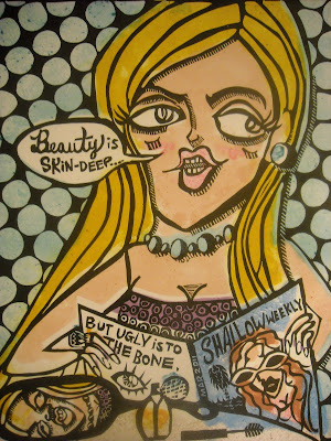
These prints were created from the ground up. The paper used to print was hand made by me and each color plate is what is known as a "pulp painting", which is a process that involves adding colored pulp to a freshly pulled sheet of cotton paper. You can see here at the end of the entry what a pulp painting looks like without a print on it!

As a reminder, linoleum blocks are a form of relief printing where the high parts are what create the marks of the print. Think of a linoleum block as a giant, custom-made rubber stamp.

The image featured here aims to satirize so-called glamor and remind us that just because someone might be good looking or pretty on the outside, it doesn't mean by the same token they are a good person.

Thanks for checking it out, all my best.
-Mike
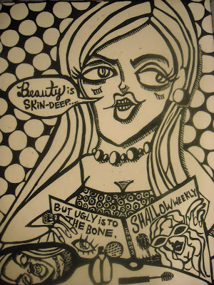
Prints are 16x20 inches on handmade paper
Color plates in a variable edition of 3
Black & Whites in an edition of 5

Saturday, April 23, 2011

SCREEN PRINTING - "Zombie Window Licker"


Hello Readers -

Today I am doing another retrospective glance into a project from last year. This image was originally created as my first screen print!

With an open theme for this project I was mostly interested in experimental drawing techniques to see what would and what would not transfer to the screen. This image was originally drawn in my sketchbook but was transferred out with mylar and then manipulated into its current form.

If you've read the previous entry about Screen Printing you might understand the technical process a little more, but basically this drawing was created with India ink and Stibilo (aquarelle) pencils. I also went back into the darker areas of my drawing and worked in a reductive fashion to get some finite lines in the composition.

I actually have used this image to create a fleet of tee shirts, as you can see pictured. If you are interested in acquiring one, please email me mheter@gmail.com

Many thanks to my friend Anthony Pistono, an exceedingly talented printmaker for modeling my design on a tee shirt for me.

Thanks y'all!