Wednesday, September 28, 2011

DUMPY DOLORES LIVES! One hundred full color, handmade, glittering Dumpy Dolores stickers!

Dear Readers:
Dumpy Dolores has come back to the sticker scene and is more fabulous than ever! Today’s entry focuses on a brand new, unprecedented run of 100 full color, glittering Dumpy Dolores stickers. 


Dumpy Dolores was created in Spring 2006. Eventually after hanging out with a Philadelphia Graffiti Artist Constituency, Dumpy was branded as a graffiti “tag” that I would put up wherever I went. Graffiti falls mostly into three categories: Paint, wheat paste and stickers. Sometimes the lines are blurred in combining the three, but what we see here are true sticker tags. There is a huge subculture of sticker makers out there in real life and on the internet. It’s fun and addicting, too. Just try going to http://www.flickr.com and search for sticker graffiti.If you'd like to see some old pics of your Dear Aunt Dolores, just search for  her by name!

Dumpy Dolores is a punching bag of jokes of vice, gluttony, laziness and being otherwise unkempt. Dumpy lives in our hearts and minds as a reminder of how things could be worse or how great things that are terrible for us are, such as cigarettes and Spam. Yes, Dumpy is aware that food that tastes good is comprised of salt, fat and sugar, which is pretty much all of the ingredients that make Dumpy so delicious herself… that, and 2 packs of menthols a day.
Making sticker graffiti has truly been one of my favorite things about being an artist. I have met and collaborated with amazing artists from all over the world and my art has traveled to far-off lands I can only hope to visit in person myself one day.

 Alas, in April 2009 I was discovered as the leader of this sticker campaign in my hometown of Montclair, NJ where I placed a superfluous amount of stickers within walking distance of my house (and the police station.) The cop who pulled me over immediately recognized 42 Dumpy Dolores stickers on the front seat of my truck. My little art movement cost me a pretty penny. Since then I have not put a single sticker on public property and boy do I miss it. This new generation of stickers is something I hope that will carry on the tradition of sticker tagging and bestow a new era of Dumpy Deliciousness onto the art scene. 

Dumpy Dolores can be found on Facebook where she makes frequent updates about her triumphs and tribulations of being an old rummy with a chest that just won’t quit. Add her today and enjoy some amusing updates in your newsfeed.

As always, many thank-yous for having a look at my blog!
Yours truly,

-Mike

P.S. 
If you would like information on how to obtain a Dumpy Dolores sticker, please email me. mheter@gmail.com

Sunday, June 26, 2011

35 mm B&W Photography

Welcome to another blog entry about my art!

Tonight I join you with something a little different. Photography! Something I love but don't do nearly enough of...

These photographs were created mostly in Fall 2009.

The photographic process is involved and requires a lot of patience. All these photos were snapped, developed and printed by me in the dark room at Montclair State University. My professor was really great and she helped me understand the process much better than the photo professor I had before.

Personally I love the portrait photography myself, but a lot of these pictures were meant as exercises to show the breadth of ways you can capture motion and light.

I won't get too much into the inner workings of how to use a 35 mm camera or darkroom equipment but I hope you enjoy my pictures.


Many thanks to my friends also for posing for these pics. Aren't they beautiful?

Thanks for looking!

-Mike

Monday, June 6, 2011

Monoprint with Handmade Paper Collage


Hello Blogosphere!

I am writing tonight with an entry about a project I completed last fall. This is an edition of 3 monoprints with hand made paper collage elements!

A monoprint, which is related to a monotype, is a unique artwork that is made with printmaking processes. The difference between a monoprint and a monotype is that a monoprint is in an edition of works that contain at least one element that is uniform to all the prints in that edition. Generally monoprints are easily recognizable as the same body of work but are slightly different depending on the manner in which they are rendered. Monotypes are generally one piece of unique work made with printmaking processes that do not have a means by which to create another work in the exact same method.

These prints are all 22X30" on Rives BFK, and the process in which they are created is fairly straight forward. Monoprints can be created easily with a large piece of plexiglass where you make a basic drawing based on what you want your final image to look like. Ink is applied to the INK SIDE of plexiglass and you have the option to work reductive or additively to change the way the ink prints onto the paper.

For instance in this piece when I made the skyscapes, I applied thick blue ink to the area that I intended to be blue and then worked in a reductive fashion into the sky with paintbrushes, paper towels and cotton swabs to reduce the amount of blue ink and let some of the white of the paper show through to allow for the effect of clouds.

In terms of additive process, much of the grass and landscape are printed and re-printed several times to build up layers of ink. The beauty of monoprinting is that an artist can achieve effective and imaginative gestures when working in this painterly process.

The rhinoceros figure is actually a collage element that was printed on handmade black denim paper separately. It is secured to the page by an industrial advertising adhesive called Sur-Tack. The form of the rhino was drawn and made into a stencil and then created perfectly three times to print. Before they were printed on they basically looked like black paper rhino silhouettes but then they were MONOPRINTED on to give them their features! The ink was specifically blended to be printed on a black paper so lots of white was added to ensure that it shows up well.

This image was inspired by endangered species and at the time I made it in 2010 I had caught news of one of the last female white rhinos in the world was killed by poachers. I wanted my work to reflect the ephemeral beauty of life on earth. 

I hope you enjoyed and as always, many humble thank yous for reading. Til next time!

-Mike

Monday, May 2, 2011

Pulp Painting and Linoleum Blocks: Round 2


Good evening readers:

A quick update about my current project - an independent study in papermaking & printmaking.

Over the past few months I have been working on a suite of prints styled after one I made last semester.

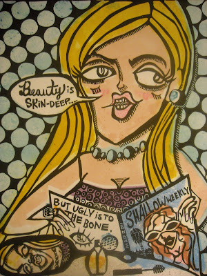
These prints were created from the ground up. The paper used to print was hand made by me and each color plate is what is known as a "pulp painting", which is a process that involves adding colored pulp to a freshly pulled sheet of cotton paper. You can see here at the end of the entry what a pulp painting looks like without a print on it!

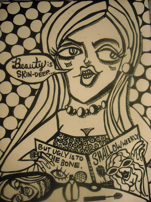
As a reminder, linoleum blocks are a form of relief printing where the high parts are what create the marks of the print. Think of a linoleum block as a giant, custom-made rubber stamp.

The image featured here aims to satirize so-called glamor and remind us that just because someone might be good looking or pretty on the outside, it doesn't mean by the same token they are a good person.

Thanks for checking it out, all my best.
-Mike

Prints are 16x20 inches on handmade paper
Color plates in a variable edition of 3
Black & Whites in an edition of 5

Saturday, April 23, 2011

SCREEN PRINTING - "Zombie Window Licker"


Hello Readers -

Today I am doing another retrospective glance into a project from last year. This image was originally created as my first screen print!

With an open theme for this project I was mostly interested in experimental drawing techniques to see what would and what would not transfer to the screen. This image was originally drawn in my sketchbook but was transferred out with mylar and then manipulated into its current form.

If you've read the previous entry about Screen Printing you might understand the technical process a little more, but basically this drawing was created with India ink and Stibilo (aquarelle) pencils. I also went back into the darker areas of my drawing and worked in a reductive fashion to get some finite lines in the composition.

I actually have used this image to create a fleet of tee shirts, as you can see pictured. If you are interested in acquiring one, please email me mheter@gmail.com

Many thanks to my friend Anthony Pistono, an exceedingly talented printmaker for modeling my design on a tee shirt for me.

Thanks y'all!

Monday, April 4, 2011

SCREEN PRINTING


Hello friends!

Today I join you with a print I made last year in December. It's a SCREEN PRINT, which is essentially forcing ink through a stencil wrought onto mesh. Silk screen is a widely used method for creating highly replicable images that can be printed on a multitude of surfaces.

Let's break it down!

The method I used to transfer my images onto the screen is widely used by printmakers. The screen itself is coated with what is known as "photo emulsion", which is essentially a light sensitive paint that covers the whole screen.

In this process, screen printing is versatile in terms of creating an image. You simply create an image with opaque drawing or painting materials, such as india ink or even acrylic paint on clear or frosted mylar. Anything you can think of, as long as it is opaque can essentially be turned into a stencil on the screen, and in reference to the light-sensitive paint, here is how that works:

The image itself is placed onto an exposure unit (which might look like a giant scanner, or a tiny tanning bed to someone unfamiliar with them) and the screen goes on top of the image. The lid of the exposure unit is closed and a vacuum seal comes on while ultraviolet light bombards the screen. The key here is that the opaque drawing BLOCKS OUT the light in the gestures of the drawing itself, thus leaving the photo emulsion untouched by the rays of the light bed. Once the image is done "burning", you then move over to was the screen with water and like magic, the marks the image blocked out from the light dissolve in the photo emulsion, leaving you with a precision stencil of your drawing! It's really awesome to watch it happen and something you're thrilled to see when you do it correctly.

Once the screen is dry, you then may set up your station. Silk screen ink is a water based acrylic ink that dries quickly, so you must work fast. It is advisable to have all of your paper (or other materials) ready to be printed because it can go very quickly, but if you're lagging getting other things together while you're printing, the tinier marks of your stencil might dry up with ink and thus alter the gestures of your images. The ink is forced through the screen by use of a squeegee that is larger than the image itself. If you make more passes, the more opaque the print will be, but you also run risk for over-flooding the screen, and all of this takes some practice to get just right. But the results are awesome for any artist interested in making prints!

My image presented here was originally conceived as a diptych, but it ended up taking on a different life. Required to be only three layers for the project grade, I actually printed on this piece seven different times. I love mythology and the myth of Hades, the Greek god of the Underworld, and Persephone, the daughter of the Earth Goddess, Demeter, has always been one of my favorites. I love every myth about the underworld, such as Orpheus & Eurydice, and Thetis dipping her infant son, Achilles, in the river Styx...

For those of you who are unfamiliar with this story, Hades abducts Persephone and brings her the underworld and bequeaths that she can leave anytime she wants, so long as she doesn't touch anything or eat anything. While Persephone is in the underworld, she notices an irresistible pomegranate tree and was so tempted she forgot the rules Hades had set, and ate of its fruit. A beautiful young goddess herself, Hades was more than happy to take her as his prisoner and subsequently make Persephone his Queen. As the weeks and months went by, Demeter, the Earth goddess, begins to despair that her daughter is missing and when she finds out the nature of her imprisonment in the underworld, falls into a deep depression. The fair weather of earth deteriorates because of the Earth goddess's melancholy and is replaced with bitter cold and awful, unfruitful weather. Mortals pray to Zeus (the King of the gods) for his mercy and seeing his devotees and Demeter herself in such a predicament, he summons Hades to explain his underhanded actions. Rules are rules, and Hades is the ruler of the underworld, so his authority must be respected, however, Zeus strikes a deal out of pity for Persephone's poor mother and the people of the overworld. Persephone will spend half of the year in the underworld with Hades, and half of the year on Olympus with her mother. Thus, here on Earth we have the warm months of spring and summer when Persephone, the nymph of the seasons, is present and with her mother. And when she is with her husband in Hades, we have the colder months of autumn and winter.

Well, that's my interpretation of it anyway

My print features Hades and Persephone in their respective landscapes, with a central image of Persephone's initial descent into the underworld, never to be the same again.

Print is 22x30" on Rives BFK

Wednesday, February 16, 2011

Pulp Painting and Linoleum Blocks


Hello and thanks for reading my first update in a staggering 6 months! Much has happened to my portfolio since I last updated here and today I join you with PULP PAINTING and LINOLEUM BLOCK printing!!

Yes, as fate would have it last semester I enrolled in a course called "paper & print" where we made nearly 100% of all of the paper we printed on. This update features the 2nd project in a semester of three, combining the process of pulp painting and linoleum.

Papermaking is an art of its own. If I were writing blogs at the time I would have made sure to make an entry just to explain it in itself, but here is a quick overview -

Paper is made of processed fibers that have been beaten into "pulp." Yes, as the expression goes "Beat you into a pulp", it is in reference to reducing plant material (or otherwise) into a simple fibrous form. Once the material has been reduced to pulp it is ready to be made into sheets! The technical process of making paper is much aided by actually seeing it done will help you understand all the better! Please check out this informative "How it's made" episode featuring handmade paper! http://www.youtube.com/watch?v=nbofx_YYaq0&playnext=1&list=PL0CCC1607CFD58360

So, getting into this two part process I first carved my linoleum block. Lino Cut is a form of relief printing (where the raised areas print) and it is a reductive process (which means the lines you cut "away" create negative space.) The size of this print is 16x20" and the theme we were given was "Visual Writing." As a play on the word "pulp" I made something inspired by "pulp" magazines of the early 20th century. I also thought of Roy Lichtenstein's conversational snippets in his work. When making this block I intended for the black and white image to stand alone as a solid piece of work, only to be enhanced by the colored PULP.

The image was also inspired by my brother, Andrew, whose co-workers actually said this to him. I got a good kick out of it when he put it up as his facebook status a number of months ago, and it stuck with me and eventually inspired a piece of work, and for that, I thank him.

If you watched the video above you might understand this next part where the PULP PAINTING comes in... Basically, the linoleum block had custom-made paper to be printed on. The sheets themselves are a mix of cotton and hemp fibers and once they were freshly made, they were pressed to 1000 PSI (pounds per square inch) to get some of the water out of the wet fibers.
Before you can begin painting with pulp, you must first make a stencil out of mylar (clear plastic) based on a proof (a test print) of your image. The mylar stencil will then be laid over the freshly pulled and damp carrier sheet and you can then move in with the colored pulp! The stencil is necessary to help control where you want your pulp to go (or the shield it from where you do not want it to go.) You have to be very exact when you make your stencil(s) based on the working proof!!

The pulp painting process is not unlike many water-based media we have all come to be familiar with. When you add lots of water the pulp becomes diluted and washier. You must also use two chemicals known as Methylcellulose (in other words, a pH neutral glue) and Formation Aid (another pulp additive) to get the pulp to behave like paint. If there is one thing I want you to walk away with having read this blog entry is that the colors on this image are NOT ink and are NOT paint, but paper itself embedded into the sheet, which is unlike anything else in my portfolio ever. It's pretty special and something I want to do more of!

Thanks for reading...!