Sunday, August 1, 2010

COLOR PLATES


Hello friends

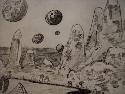
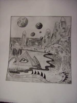
Here is something of a reiteration of my earlier posts regarding the etching prints I made for Spring Semester 2010. These are hand-colored prints that were brought to life with water color, colored pencil and crayon. Svannah Rhodes and Stacy were the only ones that would fit on my scanner bed, so I will not be joining you with the color plate of Bitumen, but hey I hope you enjoy reading anyway. Thanks for looking!!

Sunday, June 13, 2010

Old DOODz

Dear Bloggers,


I'm writing to you tonight to regale you with some old doodles from sketchbooks past. You are about to see never-before-scanned images. I just went to the trouble of scanning these drawings from 2005-2008. These are generally uncomposed sketches/doodles that I hand picked for a retrospective slideshow for your viewing pleasure. Enjoy!


Sunday, May 30, 2010

Kryptonite Rita Bust


Hello there

Today I am presenting my final project from a sculpture class I took this past semester. We could do whatever we wanted so I used my favorite character as my muse for this sculpture.

This is actually made of red clay. I originally had a strange feeling at the onset of painting clay and I still have mixed feelings about exactly what is going on here, but still I am amused by the way this all turned out.

While I was making the crystalline mass that is Kryptonite Rita's scalp, my professor suggested I make a pedestal for her. So I then went to the pottery wheel and made a cylinder form quickly, and carried the crystal motif onto it.

Some of the inspirations for this piece were also the bust of Queen Nefertiti from New Kingdom Egypt and the Walt Disney animator's 3-D study for Maleficent from Sleeping Beauty. Anyone who is interested in animation should watch the special features on the dvd, I'm telling you, it's incredible. The whole project eventually took on a life of its own of course, so now it mostly looks like a collector's bust of some kind that a sci fi geek would work all summer to buy. I wish.

But, once again, this piece isn't exactly perfect, as someone so tactfully as possible said during the final critique. But for me, this piece isn't about perfection. I think seeing a portrait bust of this character breathes new life into it regardless if it is extremely fine tuned. People in my class didn't seem to get the idea that she was a Super Villain and was supposed to have bold colors. It makes me think of her with natural colored flesh and it bugs me out ha ha ha. But, what do I know, I only created it.

Sunday, May 9, 2010

My Painting Diary


Hello readers!

Today I write to tell you about a little project that began when I bought a nice little hard bound sketchbook at Jerry's one day. Every time I get a new sketchbook I always imagine a nice book with filled with full pages and dynamic sketches. Since I was painting a lot this semester I often found myself with surplus acrylic on my palettes and it was then I decided to take this nice little book and dedicate it as a Painting Diary.

Some of the key words I want you to remember when gazing into these "sketches" is that they are informal, abstracted and completely experimental. Other than consideration for focal points in these compositions they are largely unplanned and impromptu. I find that even when art is gracefully planned or intentionally designed seems to take on a life all its own unintentionally.

The techniques used to create these were various painterly mechanics... wet on wet, wet on dry, lots of use of the palette knife, multi media with pen and magic marker, colored pencil, crayons, water color... The key word, once again experimental. They are fun to make and without the investment of trying very hard on any single one they seem to come out interestingly enough piece to piece.

Some artists who also helped me decide to make this sort of experimental work are John Fogarty, Steve Streisguth and Paul Weingarten. Be sure to click on the images to garner the subtle details!

I hope you enjoy, thanks again for reading!

Friday, April 16, 2010

FREE DUMPY


Welcome back to my blog for yet another session of TMI. Today I join you with a propaganda poster I made for one of my classes. This poster features my best-known cartoon character, Dumpy Dolores. Let's see what elements are contributing to this piece, shall we?

A little background: last year in 2009 I was found out by the police after running a graffiti campaign of hand made sticker art. Although there were several characters that popped in and out of the rotation, Dumpy Dolores was by far the bread and butter of the campaign. So, a workweek's worth of court dates and $2,200+ later, Dumpy Dolores has fallen by the way side, especially in sticker form where she is most beloved by her fans.

So, for this assignment we had to make a propaganda poster. This is a cinch for me personally because I am a fan of poster art and fascinated by the concept of subversive text. The inspiration came from my own experiences with the law and my astonishment for being punished so harshly for something that really isn't malicious. In the spirit of political prisoners and favored celebrities under harsh treatment by foreign governments or their own governments, I created this poster.

Symbolically we were supposed to employ subject matter and use colors that contributed to the overall experience of the piece. For this I chose to use red to suggest anger and outrage, blue to suggest purity and truth, black to suggest desolation and gray to hint at sadness and sympathy. The subject matter shows Dumpy Dolores behind prison bars (which I am lucky to have not been put behind) within a brickwall with keyholes, suggesting some sort of imprisonment. The text on the arch says "VIGILANCE UBIQUITOUS" which is supposed to be a haunting slogan that reminds people to watch over her. I happen to love those words a lot.

The poster is on bristol board with magic marker, paint marker and water color.

One thing I always think about are the 42 stickers the Montclair police confiscated... presumably they are rotting away in some evidence locker or perhaps they were destroyed... Either way, Dumpy Dolores is making an agonizing crawl back to the sticker scene... eventually.

Thanks for reading!

Monday, April 5, 2010

"Bitumen"


Hello and thanks for reading another entry!

Today I am going to talk about my latest project. It is a photopolymer etching. I can hear you say "Gee Mike, what is a photopolymer etching?" and I will try to explain in the best of layman's terms. Here we go!

Let's look for a moment at the word "photopolymer." We can see the first part,'photo'would most likely mean 'light' and 'polymer' would most likely refer to some kind of plastic. In this instance, photopolymer is a light sensitive plastic that is exposed to light to entrench the plate with your artwork, much in the way photographs and film "burn" images into light sensitive films. If you've read previous blogs, etching is a form of itaglio printing, which means the entrenched areas of the plate hold the ink and form the gestures of your composition.

Before you worry about the plate, however, you must first make a composition on frosted mylar with permanent medium that will be the image "burned" into the plate. The permanent medium can be wet or dry, opaque or transparent, but just so long as it is permanent.

From a technical standpoint, this is my third photo polymer etching and this one was made with different media than my first two. But, in this instance we are looking at an image created with a black Stibilo Aquarelle (watercolor) pencil. This was my first time using this approach in photopolymer, like I said, but also my first time using the Stibilo. It was much like working with an inkwash medium but with the ability to employ the semi-soft lines of a pencil. In my last two works in this media I used DecoColor paintmarkers for the most part but follow back into the plate with India Ink ink washes to add areas of gradation to the composition. The interesting thing about Stibilo in creating a compsition on mylar is that it cuts out the middle man of the ink bottle for the washy effects one can come to appreciate in the process of photopolymer etching! It is definitely a good idea to consider transparent washes because they add interesting charm to your plate.

Phew! I feel very detailed and longwinded when doing some of this explaining but I am trying to break it down as simply as I can.

Let's talk about the image:

Sometimes, much like in the way a song can stick in one's head, if I learn a new vocabulary word it just reprises in my mind over the course of days. Recently I learned the word "Bituminous" which refers to tar or petroleum in the earth. Somehow the word captivated me and I found myself thinking about elemental forces of earth and water, but more so, solid and liquid. I am truly fascinated by the concept of earth acting as a container for water. I also thought of a pre-historic aspect of tar and shale where fossils and bituminous matter take place.

On the image you can hopefully see some areas where there is wet brush among other various techniques achieved with the wet and dry capabilities of the stibilo pencil.

Thanks for reading!

Thursday, April 1, 2010

"Stacy"


Hello there! Today I'd like to show you a project I have been working on for a couple of months at this point. This process is what is known as "Dry-point Etching" which is a non toxic, straight-forward method for making plates in printmaking. Essentially what you see is what you get with the dry point process so it is almost instant gratification in terms of carving and inking your plate.

The dry point process can either be done on a piece of plexiglass or polystyrene. Essentially you are using a flat piece of plastic to make a plate. The process is as simple as using your etching needles directly on the plate and carving out what will become the distinctive lines of your composition. No ferric chloride involved! Since the etching process is in the itaglio (recessed) family of printmaking, that means the parts you carve away will take the ink and create the lines. (As opposed to relief printing where the removed carvings create negative space such as a lino cut or a woodblock)

I originally started and printed this project at the beginning of the semester (early February) and turned it in for a better grade after re-working the plate to add some more details and character to the aerial perspective. This piece features my emaciated, miserable, broken-hearted ghost character, Stacy, who somehow died of a broken heart and comes back to haunt the culprits of the crimes of love. I haven't really developed her story, as is with most of my 'toons, but she is fun to draw and her subject matter is another facet in a wacky world of inconsequential cartoons that inhabit the pages of my sketchbooks. Here we have Stacy standing on a grave in the middle of a bleak graveyard.

The process itself was not that time consuming and I especially liked it because I was able to work on my plate while I was on the train or in the car. You could conceivably carve your plate anywhere you can take your etching needles, which is cool because during the course of labor on this plate, I was working on it on my way to the printmaking studio and printed it right when I go there. How convenient! Convenience is definitely a key word with the dry point etching because you can re-work the plate as many times as you wish, it is as simple as cleaning the ink off and adding the details where you see fit, anytime, anywhere.

This is actually my very first dry point etching, which was why I was timid at first to really carve the plate, but seeing the results of the 2nd edition of prints after re-working the plate, you can reach a high level of potential with this process.

Once again I apologize for the crumby webcam photo of Stacy, as with Savannah, but i think you will see the details well enough. This is just a proof, but there is now an 5 prints in this edition. Let me know if you're interested in somehow acquiring one from me. Thanks for reading!

-Mike

Sunday, March 28, 2010

Savannah Rhodes


Hello fellow bloggers, I welcome you to my first update in a staggering two years! But, I would like to share with you a current piece I am working on, and it is called "Savannah Rhodes. " The featured image is only a proof. This is not the finished project.

Savannah Rhodes was originally conceived sometime in 2007 or 2008 but it was only in 2010 she was unearthed from obscurity of sketchbooks past and brought to life in printmaking. The concept of Savannah was originally called "Bitch on the Lam" and it it makes reference to a certain cinematic archetype of a beautiful, perhaps deadly, renegade, female driving a convertible. There is another sketch I would like to unite with Savannah Rhodes' story, which involves a place called Blister Field which is a a remote drought stricken community in Blister County, an ambiguously southwestern American rural zone with a strange secret. Alas, this has yet to ever be put together, but for now we have a glimpse into Savannah's life as a vixen with windswept hair and dark sunglasses with a distant, monumental desert landscape in the background.

From a technical stand point, you might like to know that this is my first time ever making a copper plate etching. The process is quite amazing and I will say you never know what it feels like to see your art imbued into rare earth elements until you're cleaning the etching ground off with paint thinner and it comes gleaming back to life with every mark you made intact.

The process begins with a plain copper plate that you must carefully polish and degrease. After that you apply what is called "etching ground" to the plate and make a smooth, even skin of the ground over the surface of the copper plate. Etching ground is some kind of bituminous, waxy substance that can either be applied wet, or melted from a hard form onto a warmed copper plate. Think of it as a protectorate of the smooth surface of the copper plate. When the etching ground sets up for a day or two you may then transfer your art work to the black etching ground with a piece of tracing paper and a bright piece of pastel or chalk. Once you have transferred your drawing and are careful enough to not wipe off the delicate chalk lines, you then begin with the etching needles. The etching needles are very sharp so they cut right through the ground and you have a reasonable control of weight and thickness by choosing your needle size and the pressure and gesture with which you make a given line.

Once you are finished scraping the lines of your artwork into the etching ground, it is then time to go to the acid! I was very afraid of the acid at first because it sounds so diabolical, but no, the acid is your friend because it so beautifully "bites" into the copper you exposed from the etching ground. So, the way metal corrodes, or dissolves is expedited by a catalyst such as acid and in a matter of seconds thin trenches will have been "bitten" away from the surface of your copper plate. The result is rewarding because it is not only amazing to watch the chemistry unfold before your eyes, but also because it is quite beautiful and shiny. Before you dip your plate you must tape the backside of it as to protect it from being bitten as well. You then attach a tail to the back of the plate with tape to enable easy lowering into and lifting out of the acid.

It sounds simple, right? But there is a trick in copper plate etching that garners a wonderful quality and differentiation of line that is nefarious enough to deserve honorable mention. To get that nice variation in line thickness, you can bite your plate multiple times in different areas by blocking them out with etching ground. For instance, here on Savannah, the background, middle ground and foreground all spent individual amounts of time in the acid bath. The background is intended to be distant, so it was only bathed in acid for 12 minutes. Then the plate was removed from the acid, neutralized and washed. Then the entire background of the piece was blotted out with etching ground again and this time the rest of the plate (the foreground and the middle ground) received another 15-20 minutes in the acid. So, in order to make Savannah's details pop out it required a third blot out with the acid bath, this time covering the car (middleground) and the background as to not expose themk to the acid. Savannah's figure was then etched in for another 20 minutes. The breakdown happens like this: The Background got 12 minutes, the middle ground got 32 minutes and the figure got 52 minutes all together. Imagine the possibilities with your own artwork if you were to ever try this!

Another technique in copper plate etching is called "aquatint" which is a ground technique that uses spray paint to ground the etching plate. Here on Savannah, the aquatint was most extensively used on the body of the car and her sunglasses. As you can see, an impossible-with-the-stylus cloudy effect is achieved by the misty, smokey quality of the spray paint that grounded the undisturbed copper that was once there. This process involved grounding all of the plate out except for the car and sunglasses, and delicately sweeping puffs of spraypaint over the targeted areas (the glasses and the car body.) Once the paint was dry, Savannah's aquatinted car went for a bath in the acid and it garnered a nice, even neutral gray that definitely achieved the look I was hoping for. Copper plate etching really takes guts, I have to tell you, because you do some very indelible things to your work! Right now I am contending with some unintended lines that mysteriously appeared on the plate, but we'll see how all of that goes. I am still learning!

So far Savannah is a work in progress, and the process has been time consuming but with enough practice I definitely see how copper plate etching is a worthwhile endeavor for creating plates. I regret to share with you such a crumby picture of her but I don't have my camera cable with me, so webcam will have to do. I hope if you've ever wondered how to do a copper plate etching this entry shed some light on the subject! I recommend this for anyone who is into printmaking.

-Mike